Case study
NietsCo Aperiniets
Universe
No-Low
Client
Premium non-alcoholic spirits brand
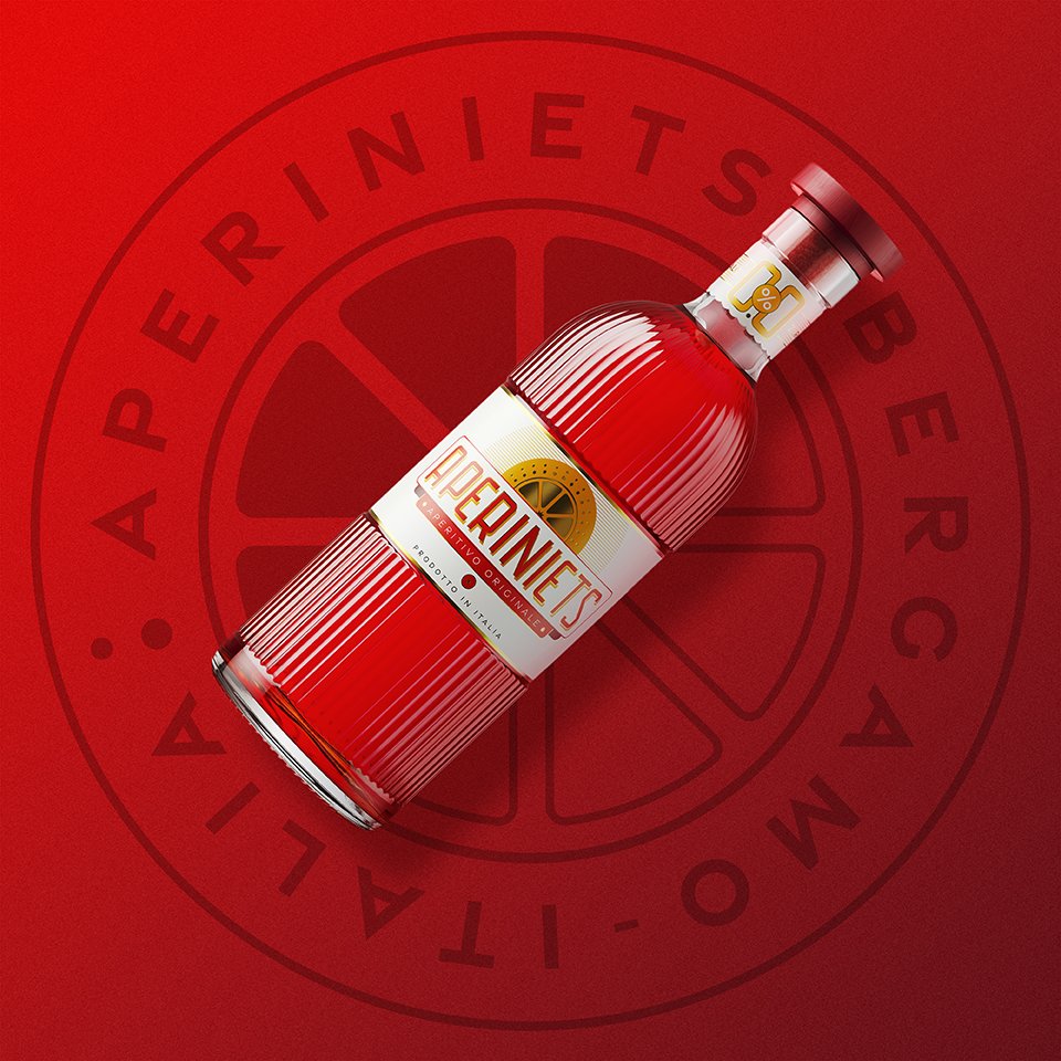
Key detail
Custom laser engraving on wood, sprayed in red

Context
NietsCo. is a premium non-alcoholic spirits brand redefining what alcohol-free drinking can be. Our complex, balanced drinks are designed for moments of celebration, care and ritual. Aperiniets was born from the desire to reimagine the aperitivo, offering an alcohol-free option with depth and character for those who choose to drink different.
Challenge
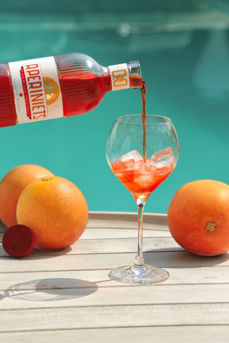
Our ambition was to create a bottle that immediately evokes the Italian dolce vita, capturing a sense of effortless elegance, warmth and celebration. We wanted the product to feel high end and desirable, while remaining accessible as an affordable premium offering. At the same time, the packaging needed to enhance the natural colour of the drink and showcase it as a key part of the experience, without losing authenticity.
The challenge was to strike the right balance between refinement and honesty, creating a bottle that feels joyful, premium and true to the product inside.
Solution
For this project, the closure was developed to support a premium yet approachable bottle experience. A wood-based solution was chosen to preserve authenticity and warmth, while custom laser engraving added a distinctive branded detail.
The engraved element was then finished in the selected red tone, helping the closure connect visually with the rest of the packaging while keeping a natural, tactile feel. The result brought together elegance, recognisability and material honesty in a way that felt fully aligned with the Aperiniets universe.
Result
The final closure elevated the overall perception of the bottle, giving the product a more premium presence and helping it stand out clearly on shelf. It feels fully aligned with the brand DNA we set out to express, reinforcing our positioning and visual identity.
Feedback following the launch has been extremely positive. Customers, distributors and partners consistently commented on the look, feel and coherence of the bottle, often highlighting how considered and distinctive it feels.
We are most proud of how seamlessly the closure integrates with the rest of the packaging. The collaboration resulted in a detail that not only enhances the product aesthetically, but also strengthens the story and values behind the brand.

Looking for the right closure for your own project?
Tell us about your bottle, your category and your ambitions — and we’ll help you shape a closure solution that feels technically right and true to your brand.
